SILVER PALATE
SILVER PALATE
Problem
As part of a brand refresh, this long-standing, family-owned restaurant needed a modern update to both its printed and digital menus. The goal was to introduce a more current, playful look while preserving the warmth and authenticity that has defined the business for over 30 years.
Solution
I created a cohesive redesign that aligned with the restaurant’s new brand identity.
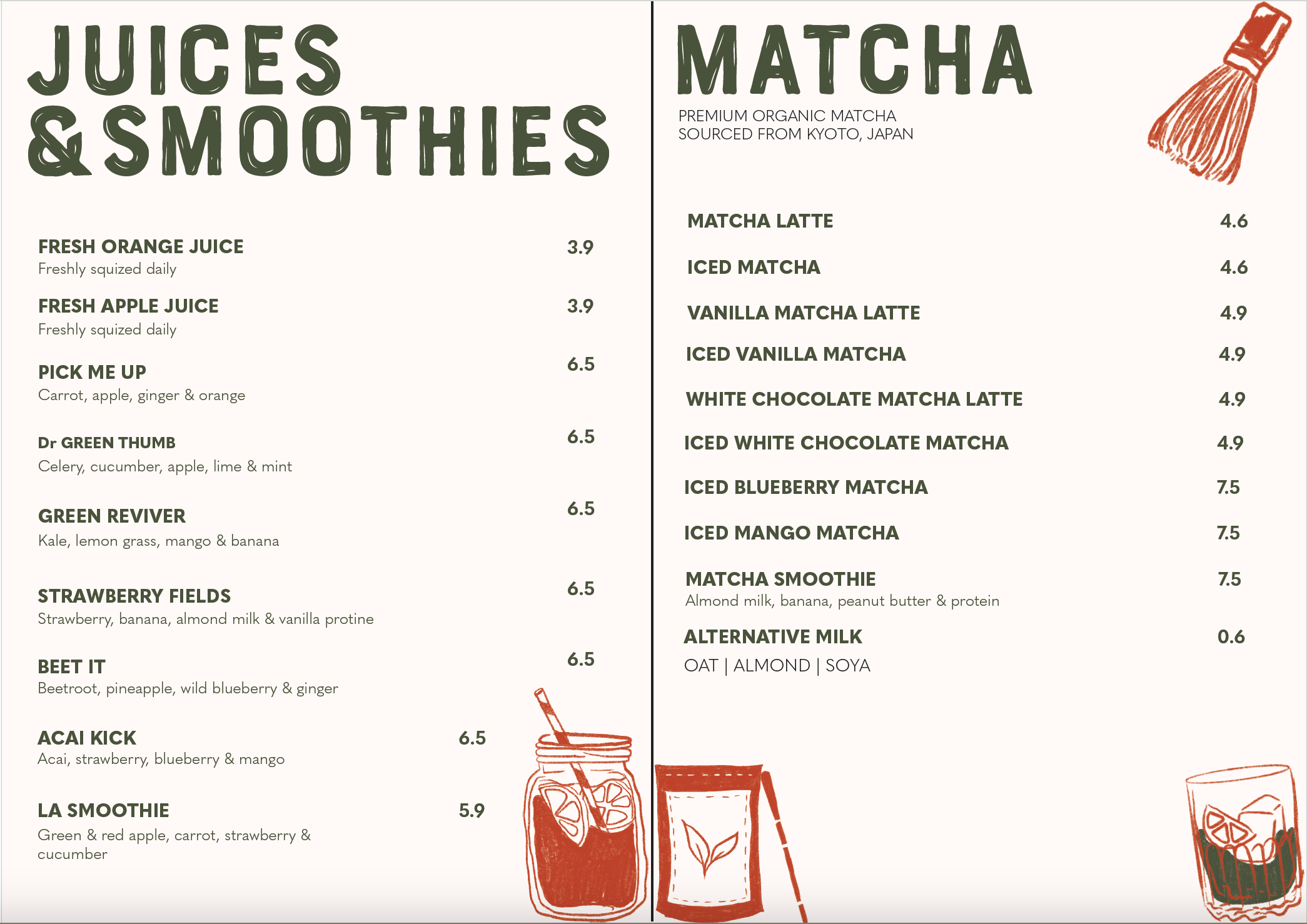
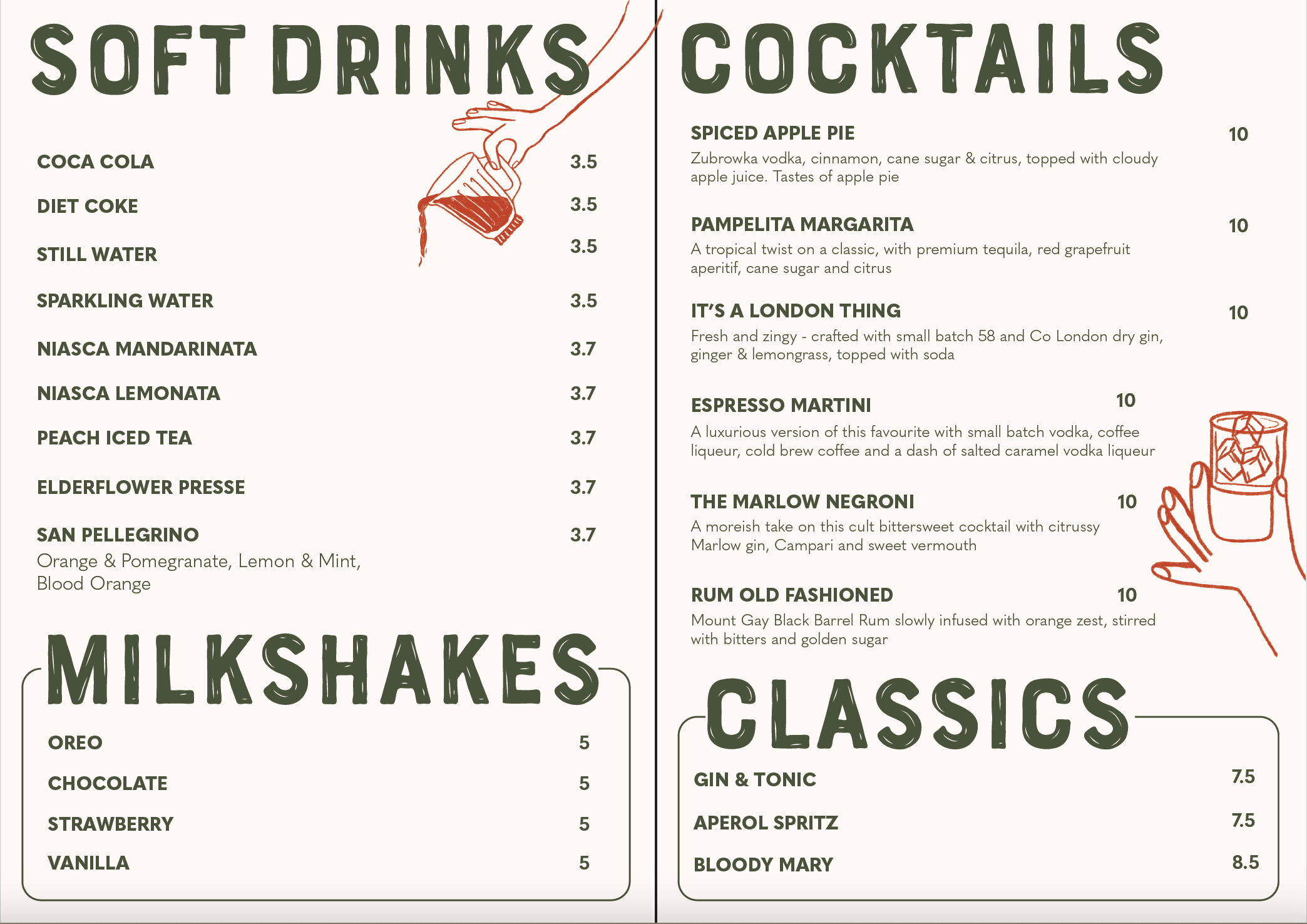
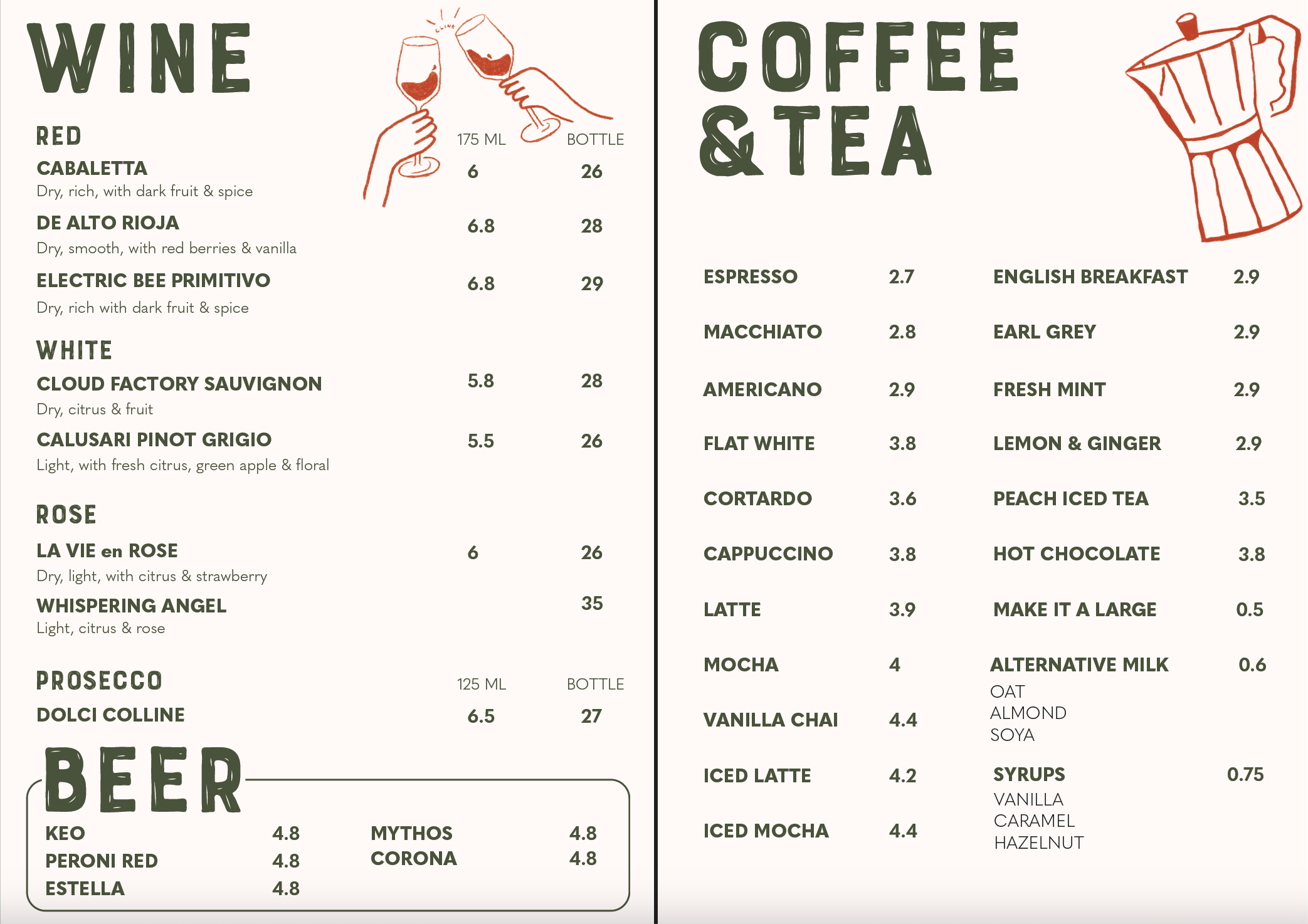
Illustrations: Custom, sketch-style drawings to reflect the raw, handmade quality of a family-run kitchen.
Digital Motion: Subtle animated elements on digital menus to add personality and improve user interaction.
Brand Consistency: Careful use of the updated colour palette and typography choices that supported the refreshed visual identity: modern, friendly, and rooted in tradition.


I wanted to maintain a handmade feel while ensuring a clear distinction between the two cards. The student card needed to be playful yet mature, avoiding a childish look, while the loyalty card carried the same brand identity but with a more sophisticated touch. My goal was to create designs that people would be proud to keep in their wallets.